The current AI image market is crowded, but the real gap has become easier to see: many tools can make attractive pictures, yet fewer can handle usable text, clean editing, and a workflow ordinary creators can learn quickly. That is why gpt image 2 stands out as a timely product to examine right now.
What makes the platform worth a closer look is not just the promise of image generation itself. It is the way the site positions the product around practical output: photorealistic visuals, image editing, multiple aspect ratios, several output formats, and a clear emphasis on text inside images. From a review perspective, that matters because modern creative work is rarely just “make me a pretty image.” More often, it is “make me a social post,” “turn this concept into a product shot,” or “fix this image without opening a heavy design tool.”
In that sense, the platform is best understood not as a generic AI novelty, but as a compact creation workflow. The homepage suggests a tool built for people who want to move from idea to asset with as little friction as possible, while still keeping some control over style, framing, and revision.
A Practical Framework For Testing Real Value
To judge the product fairly, I would not start from marketing language alone. I would test it through the kinds of tasks that usually separate a flashy demo from a useful tool: a text-heavy poster, a product-style image, and a simple image edit. Those are common, commercially relevant tasks, and they expose whether a generator understands prompts, keeps subjects coherent, and makes revision feel manageable.
That framework is especially appropriate here because the homepage repeatedly emphasizes text rendering, photorealistic output, multi-style creation, and natural-language editing. In other words, the official message is not only about visual quality. It is also about control. For many users, that is the more important claim.
From a practical user perspective, the product looks strongest when the task has a clear objective. If you know what you want to make and can describe it in plain language, the workflow appears designed to reward that clarity. If your prompt is vague, the result may still be interesting, but the site itself strongly implies that specificity is part of getting the best performance.
What The Interface Reveals At First Glance
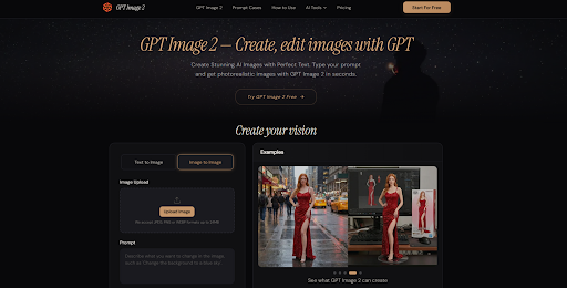
The interface communicates its priorities clearly. Users can switch between text-to-image and image-to-image modes, upload an image in JPEG, PNG, or WebP format, and work from a visible prompt box. The page also surfaces quality choices, several common aspect ratios, and a generate button tied to a credit cost, which makes the workflow feel direct rather than hidden behind complex menus.
That matters because many AI tools overwhelm new users with too many controls too early. Here, the experience appears intentionally simplified. You describe the image, choose a few visible settings, and move forward. The site also presents galleries of example outputs across illustration, portraiture, product imagery, and design-oriented visuals, which helps signal the kinds of results the team wants users to expect.
The broader impression is that the platform is aimed at creators who want a low-learning-curve environment without giving up all creative direction. It feels more like a working surface than a research playground.
The Official Workflow Stays Refreshingly Short
The site presents a three-step process, and that simplicity is one of its most convincing qualities. Instead of inventing extra setup, the workflow stays close to what the homepage explicitly shows.
Step One Starts With Prompt Clarity
The first step is to enter a prompt that describes the desired image in natural language. The page encourages users to be specific about composition, style, color, and any words that should appear in the image.
Specific Visual Language Improves The First Result
This is a small but important detail. The product is clearly presented as a prompt-responsive tool, not a one-click magic box. For users making posters, mockups, or scene-based visuals, the likely advantage is better first-pass direction. The likely limitation is equally clear: weak prompts will probably lead to weaker or more generic outcomes.
Step Two Focuses On Output Preferences
The second step is to customize settings. On the homepage, that includes quality choices, common aspect ratios, and, in the written usage section, output format and style direction.
Settings Matter Most When The Task Is Defined
This part of the workflow makes the tool more practical for real work. A square image, a vertical story asset, and a wide banner do not solve the same problem. The visible settings suggest that the platform understands this. At the same time, users should not assume settings alone will rescue an unclear concept. The settings help shape output, but they do not replace prompt discipline.
Step Three Turns Generation Into Iteration
The third step is to generate the image and then refine it if needed. The site explicitly says users can follow up with natural-language instructions to improve the result.
Follow Up Edits Appear Central To The Experience
This may be one of the most useful parts of the product. In real creative workflows, the first output is often not the final one. The page positions iteration as normal, which is a healthier message than pretending every result will be perfect immediately. For users who value speed, this makes the tool feel more like a collaborator than a one-shot generator.
Three Common Creative Tasks Reveal The Strengths
From a practical testing perspective, gpt image 2 looks most compelling when the task combines visual generation with communication goals, rather than pure art for art’s sake.
A Poster Test Shows Text Handling Priorities
A poster or infographic is a hard test because image generators often fail on legible words. The homepage repeatedly highlights text rendering as a core strength, so this is where the product makes its boldest impression. If that claim holds in real use, the advantage is obvious: fewer broken headlines, fewer distorted labels, and less cleanup after generation. The tradeoff is that complex layouts still depend heavily on prompt precision. Good text rendering does not automatically guarantee excellent information hierarchy or design taste.
A Product Visual Test Measures Realism
A product scene is useful for judging whether the platform can turn a commercial intent into something visually credible. The site showcases product-oriented examples and explicitly lists e-commerce use cases, so this is a natural fit. In that scenario, the likely benefit is speed: turning a description into a presentable concept image without a traditional shoot. The likely caution is consistency. If a brand needs highly repeatable campaigns across many assets, users may still need multiple rounds to lock in a dependable style.
An Edit Test Examines Iteration Stability
The image-editing angle may be especially attractive for non-designers. The site frames editing in natural language, with use cases such as removing objects, changing backgrounds, or adjusting lighting. That lowers the barrier for people who do not want manual masking. Still, from a realistic perspective, edited outputs may vary depending on how complex the original image is and how ambitious the requested change becomes.
How It Compares With Typical Generator Workflows
A fair comparison is not about declaring one tool universally best. It is about understanding where this platform appears more usable than the average AI image experience.
| Dimension | This Platform | Typical AI Image Tool |
| Entry barrier | Simple visible workflow | Can be cluttered or unclear |
| Prompt guidance | Strong emphasis on specificity | Often leaves users to guess |
| Text inside images | Presented as a major strength | Frequently unreliable |
| Editing flow | Natural-language revision is central | Editing may feel secondary |
| Output control | Clear aspect and quality options | Varies widely by tool |
| Learning cost | Relatively approachable | Sometimes steeper |
The key distinction is that the platform seems designed around production-oriented tasks rather than pure experimentation. That makes it easier to recommend for creators who need assets with a job to do.
Where The Experience Still Needs Realistic Expectations
The official page is persuasive, but a careful review should still stay grounded. First, results will likely depend a lot on prompt quality. The site itself encourages specificity, which is usually a sign that good inputs matter. Second, more complicated scenes or text-heavy compositions may require several rounds of refinement. Third, while the platform presents itself as capable across many styles and scenarios, users should still expect some variation between attempts.
There is also a practical difference between a strong demo and a repeatable workflow. A solo creator making one hero image may judge success differently from a team trying to generate a consistent batch of campaign assets. The tool appears promising for both, but the workload and tolerance for iteration will not be the same.
Who Benefits Most From This Type Of Tool
The users most likely to benefit are people who need visual output with clear functional goals: marketers making social graphics, e-commerce teams exploring product visuals, creators testing thumbnail or poster ideas, and non-designers who want to edit images through plain language instead of traditional software habits.
For those users, the appeal is easy to understand. The site presents a short workflow, visible controls, flexible creation modes, and a practical emphasis on text rendering and iteration. That combination will not remove the need for judgment, and it will not guarantee perfect results every time. But it does suggest a tool that is trying to solve real creative friction, not just impress with novelty. In a market full of image generators, that is a meaningful distinction.