
How To Create A Chart Or Graph In Excel
Charts are a great way to visually communicate data and information to your audience. Charts are constructed from the data that they depict. The first and most important step in creating a chart is determining the appropriate data to include in the chart.
Make a Chart
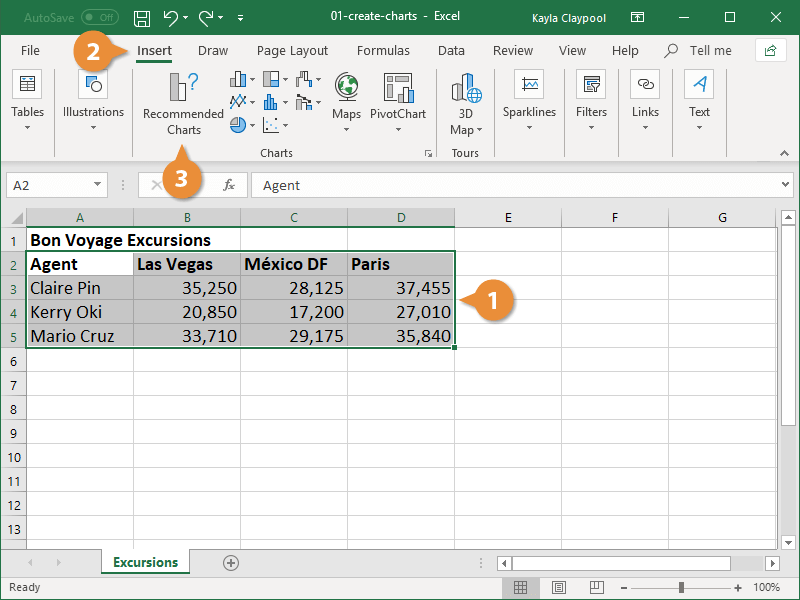
1. Identify the information that will be included in your graph.
If you want the names of your columns to appear in the chart, make sure to include them in the text of your table.
2. Select the Insert tab from the drop-down menu.
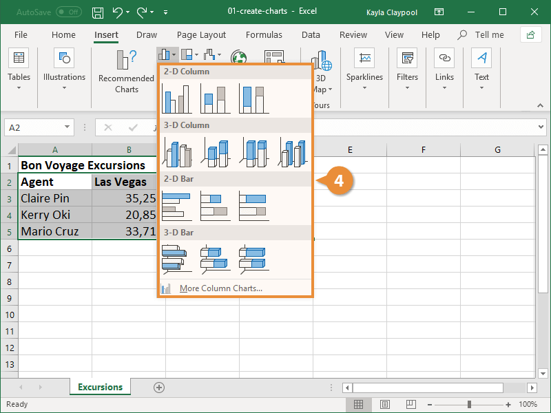
3. Select a chart type from the Charts drop-down menu.

4. Select a chart type from the drop-down menu.
The chart is displayed within the worksheet, and the Chart Tools can be accessed via the Ribbon at the top of the screen. Modifying and formatting the chart is made possible by three new tabs: Design, Layout, and Format.
Make a List of the Recommended Chart
It can be difficult to determine which type of chart will best illustrate your data on a given occasion. Recommended Charts are provided by Excel to assist you in making your selection. This tool analyzes the data you've selected and recommends a few charts that will adequately represent it in a visually appealing manner.
1. Identify the information that will be included in your graph.
2. Select the Insert tab from the drop-down menu.
3. From the drop-down menu, choose Recommended Charts to display.
Excel generates chart recommendations based on the data you've entered into the spreadsheet.
4. Select the type of chart that will be used.
Following your selection of the chart, a preview and description of the chart appear to the right of the screen.
5. Press the OK button to confirm your action.
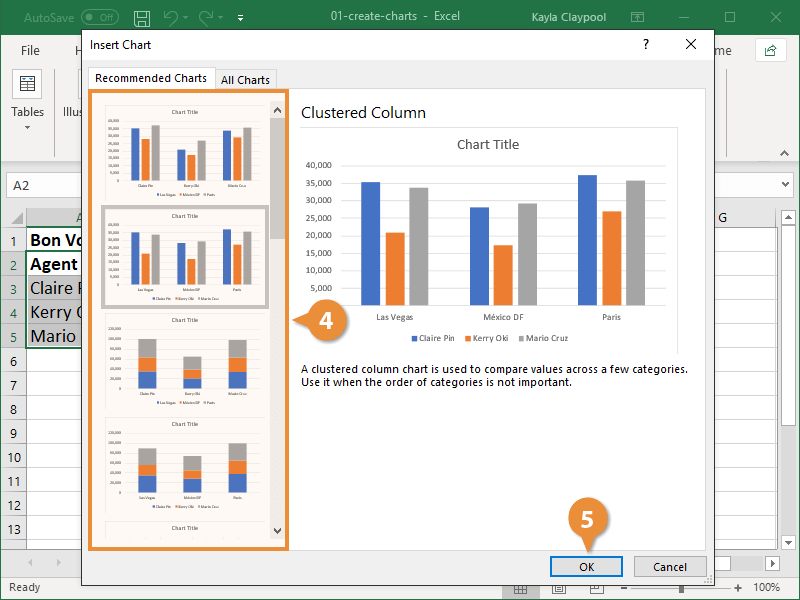
The chart that was recommended has been added to the worksheet.

