How To Edit A Legend In Excel
In addition to using predefined chart layouts, you can manually add or edit individual chart labels, such as the chart title or axis titles, on a chart.
- Changing the title of the chart
- Addition of Axis Titles
- Positioning of the Chart Legend
Changing the title of the chart
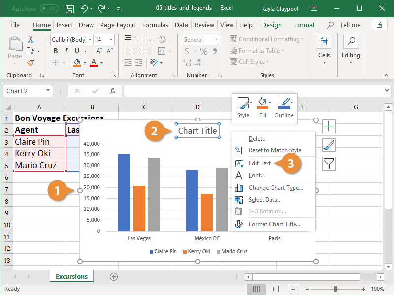
The chart title, which is typically displayed above the chart and describes the data being displayed, is typically displayed above the chart. You have the option of creating a completely new chart title or editing an existing one.
1. Select the chart.
2. Right-click on the chart's title to bring up the context menu.
3. Select the Edit Text icon.
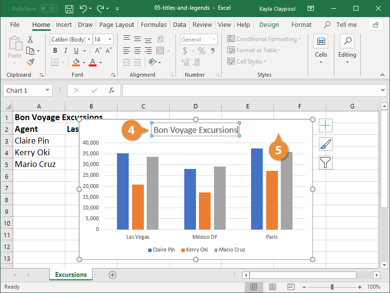
4. Fill in the blanks with the new title for the chart.
5. Click anywhere outside the title area.
Addition of Axis Titles
The titles of the axes provide information to the audience about the data category being represented. It can be difficult to communicate information accurately if you don't have them.
1. Select the chart.
2. Click Chart Elements button
Hover your mouse over the label options in the list to see a preview of them on your chart before making a decision on which to use.
3. Select the Axis Titles radio button.
Each of the axes, vertical and horizontal, is represented by a text box.
4. Enter descriptive axis titles.
5.Click outside of the title area.

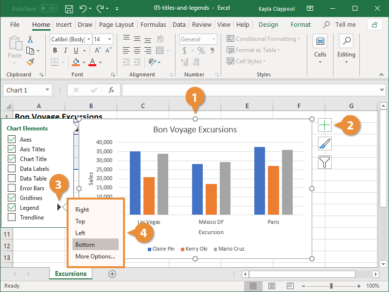
Positioning of the Chart Legend
Most of the time, when creating a chart, a legend is automatically included. The information depicted in the plot area of the chart is described in the chart's legend.
- Select a graph to work with.
- Click the Chart Elements button.
- Select the Legend icon.
- Select a position for the legend.